Self portrait drawer: complete guide and techniques
Rembrandt van Rijn painted himself roughly 100 times. Forty paintings. Thirty-one etchings. Seven drawings. That's nearly one in every ten works he ever created, a four-decade visual diary that tracked him from a cocky young Leiden boy with wild hair to a bankrupt, swollen-faced old man who'd outlived most of the people he ever loved. He never stopped looking. He never flinched.
That number is staggering. It tells you something fundamental about self portraiture: it isn't vanity. It's inquiry. The great self portrait drawers weren't admiring themselves. They were interrogating themselves, testing their craft, and doing the hardest work any artist can do, which is to look honestly at the face in front of you and put it down on paper or canvas as true as you possibly can.
You want to do that. Maybe you've stared in the mirror and wondered what it would take. Maybe you've doodled faces in the margins of notebooks for years and want to push further. Maybe you've bought supplies and let them sit. Whatever brought you here, you're in the right place.
This guide covers everything. The history, the famous practitioners, the exact proportions, the tools, the methods for pencil and charcoal and digital, the common traps, and a complete first-session walkthrough. By the time you reach the end, you'll know more about drawing a self portrait than most people ever learn in a casual art class.
But first, before we get into any of that, there's something worth knowing about the fastest route to the result most people actually want.
The fastest route to a portrait worth keeping
Most people who search for "self portrait drawer" aren't only interested in learning to draw. Some of them want a portrait. A real one. The kind that hangs on a wall and stops visitors cold.
That's a different thing entirely, and it has a much shorter path.
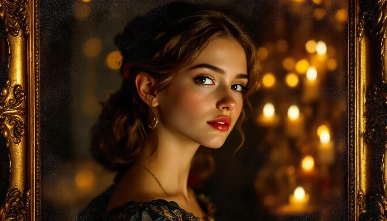
Fable transforms your photo into a classical or renaissance-style portrait painting, the kind of thing that looks like it belongs in a museum. You upload a photo, choose your style, and Fable's artists render you in the tradition of Rembrandt, Dürer, or the Dutch Golden Age. The result is a print-quality piece of wall art. No drawing lessons required. No months of practice. No supply runs.
If you want to give someone a self portrait as a gift, or if you want one for yourself and you'd rather skip straight to having something extraordinary on your wall, Fable's custom portrait service is the honest answer. Check the pricing page to see the options.
That said, this guide exists because learning to draw yourself is one of the most valuable things a person with any interest in art can do. The skill compounds. Every session teaches you to see faces better, and once you can see them better, you see everything better. The practice is worth it for its own sake, entirely apart from the finished drawings.
So here's how we'll run it. This section is your shortcut if you want a masterpiece now. Everything that follows is your roadmap if you want to earn the skill yourself. Both paths lead to a portrait worth keeping.
Why artists throughout history drew themselves
Self portraiture is the oldest continuous tradition in Western art. It predates photography by four centuries. It predates cheap models by considerably longer than that.
The practical reason is simple: the artist was always available, always willing to pose, and never charged a sitting fee. When Van Gogh was too broke to hire models, he sat down in front of the mirror and got to work. When Rembrandt wanted to study the way emotion moved across a face, he made faces at himself and drew what he saw. The face in the mirror was free, patient, and infinitely expressive.
But the motivations run deeper than economics. Drawing yourself forces a quality of attention that drawing another person rarely demands. When you sit across from a model, there's natural social distance. When you draw yourself, that distance collapses. You're looking at the thing that looks back at you every morning, the face you've seen ten thousand times, and you're being asked to look at it fresh. That's genuinely hard, and the difficulty is the point.
There's also a confessional element. The greatest self portrait drawers understood that they were creating a record. Rembrandt's late self portraits are documents of a man who lost his wife, his fortune, and his public standing and kept painting anyway. Frida Kahlo's self portraits are dispatches from a body in constant pain. Käthe Kollwitz's charcoal self portraits are the face of a woman who watched her son die in the First World War and kept working for three more decades.
None of them were performing. They were reporting.
That tradition, that combination of craft problem and honest reckoning, is what makes the self portrait the most demanding and most rewarding subject any artist can attempt. It requires you to see clearly. It requires you to represent what you see, not what you wish you saw. And it gives you a record of who you were at a specific moment in time, which is its own form of permanent gift.
Six self portrait drawers who changed art history
These aren't just names to drop. Each of these artists solved specific technical problems in self portraiture, and understanding what they did gives you something concrete to try in your own work.
Albrecht Dürer (1471-1528)
Dürer was thirteen when he drew his first self portrait. It was a silverpoint drawing, a technique that requires a silver-tipped stylus on specially prepared paper and produces fine, delicate lines that can't be erased. At thirteen, he produced a work precise enough that art historians still study it as a technical achievement.
That drawing is believed to be the earliest known autonomous self portrait in Western art, meaning the first self portrait that exists as a complete work rather than as a detail in a larger religious composition. Everything before it was a face tucked into a crowd scene or a donor portrait in the corner of an altarpiece. Dürer made himself the subject.
His 1500 Munich self portrait pushed it further. He painted himself in full frontal view, a composition historically reserved for depictions of Christ, with his hand positioned near his chest in a gesture that echoes Christ's blessing posture. It was a deliberate statement about the divine nature of artistic creation. It was also technically brilliant: the fur trim on his robe, rendered in tiny individual strokes, remains one of the most studied textures in painting history.
For self portrait drawers, Dürer's real lesson is in his engravings. He was a master of cross-hatching, using dense parallel lines crossing at angles to build tone and form. Study his Saint Jerome or his Melencolia engravings and you'll see a vocabulary of mark-making that remains the foundation of pencil and pen drawing today. His lines don't just describe volume, they create it.
Rembrandt van Rijn (1606-1669)
The numbers are worth repeating. About 100 self portraits. Roughly 10% of everything he made. For comparison, Peter Paul Rubens, one of the most prolific painters of the same era, made only seven self portraits total.
Rembrandt treated the self portrait as a laboratory. His early works show him experimenting with expressions. There are self portraits where he's scowling, laughing, grimacing with his mouth open, shouting. He wasn't making polished images for patrons. He was studying how the face moves, how emotion deforms the features, how light falls differently across an angry forehead than a relaxed one.
His late self portraits are different in kind. Painted after bankruptcy, after the death of his wife Saskia, after the death of his son Titus, they show a face that has been thoroughly lived in. The skin is thick and heavy. The eyes are tired and knowing. The paint is built up in thick impasto strokes that create literal texture, ridges of paint that catch the light. These are among the most honest images of aging in all of Western art.
What he did with an etching needle is equally remarkable. He used it like a drawing tool rather than an engraving butt, creating scratchy, spontaneous lines that build texture through cross-hatching. His self portrait etchings show a completely different register of the same face, quicker, more nervous, more experimental.
For any self portrait drawer, the Rembrandt lesson is: don't make one. Make many. Make them over years. The series matters more than any single work.
Vincent van Gogh (1853-1890)
Thirty-six self portraits in four years. Van Gogh painted himself between 1885 and 1889 because he couldn't afford models. The man was genuinely poor, painting in rented rooms with a small allowance from his brother Theo, and models cost money he didn't have.
So he sat in front of the mirror and worked. His self portraits track his mental deterioration and his technical evolution simultaneously. The early ones are darker, more conventional. As he developed his signature style, the hatching patterns became more pronounced, the colors more intense, the brushwork more expressive. His reed pen drawings from Arles use swirling, rhythmic marks that give his face the same visual energy as his famous wheat fields.
The self portrait painted just after he cut off part of his ear, showing him with a bandaged head in a fur hat, is one of the most recognizable images in art history. He painted it with his left hand because he was right-handed and had injured his right ear. The painting shows no sign of distress in the mark-making. He was that good.
The Van Gogh lesson for self portrait drawers: your marks don't have to be neutral. The way you put down a line can carry emotional information. Nervous, tight lines feel different from loose, confident ones. Swirling marks feel different from straight ones. Pay attention to your marks, not just to what they describe but to how they feel.
Frida Kahlo (1907-1954)
Fifty-five of Kahlo's 143 known paintings are self portraits. That's 38% of her entire output concentrated on her own face.
She began painting after a bus accident at eighteen left her bedridden for months. Her parents hung a mirror above her bed so she could see herself. She started painting because it was something she could do lying down. The confrontation with her own face during that period of physical suffering became the subject she returned to her entire career.
Kahlo's self portraits mix folk art, Surrealism, and pre-Columbian Mexican iconography in a way that no Western European tradition had produced. She deliberately exaggerated her features, the thick connected eyebrows, the faint upper lip hair, the strong jaw. In an art world where women were expected to make themselves palatable for the male gaze, she refused.
The results are sometimes disturbing. In some paintings her face is calm while her body undergoes symbolic surgery or transformation. In others she floats in space or grows roots into the ground. But the face is always there, watching, and it always feels like the most honest thing in the composition.
A Kahlo self portrait sold at auction for $54.7 million, a record for a female artist. That price reflects the cultural weight the work has accumulated, but it also reflects the raw technical quality. Her brushwork is meticulous. Her details are microscopic. If you look closely at her eyebrows in any of the major self portraits, you'll find individual hairs rendered with a brush that must have been no wider than a few millimeters.
Käthe Kollwitz (1867-1945)
Kollwitz made over 100 self portraits across her career, working in charcoal, pencil, etching, and lithography. She never idealized herself. Not once.
Her self portraits are documents of political commitment and personal suffering. She worked in Germany through two world wars, lost her son Peter in the first, lost her grandson in the second, and watched the Nazis expel her from the Prussian Academy of Arts in 1933 because her work depicted the suffering of the working class too honestly for their purposes. She kept working.
What makes Kollwitz important for self portrait drawers, specifically for those interested in charcoal, is her line quality. Charcoal allows wide, soft marks that can build form through broad strokes rather than delicate hatching. Her self portraits often show heavy shadows built from overlapping charcoal marks that create a physical weight on the paper. The faces look like they have gravity. They look tired in a way that isn't weakness but endurance.
Her late self portraits, made when she was in her seventies, show an old woman looking at herself with complete frankness. No vanity. No apology. Just a clear-eyed record of where the time had gone.
Chuck Close (b. 1940)
Close has prosopagnosia, a neurological condition that makes him unable to recognize faces, including his own. He can't reliably identify his own wife at a party. He can identify people by voice, by gait, by context, but not by the raw information of a face.
This is the man who decided to spend his career painting faces at enormous scale.
His solution was the grid method. He photographs his subjects, breaks the photograph into a grid of small cells, and then works cell by cell, painting or drawing the abstract shapes and tones within each cell without ever trying to see the face as a whole. The face only emerges when you step back and the cells resolve into a recognizable image.
His 1967-1968 Big Self-Portrait is 107 by 83.5 inches, nearly nine feet tall. The face fills the canvas completely. Every pore is visible. Every stubble hair. He built it from a photograph, cell by cell, and the result is simultaneously hyper-realistic and strangely mechanical, a face made of information rather than felt recognition.
Close's work proved something counterintuitive: you don't need to see the face as a face to draw it accurately. You just need to see the shapes. His method is the most accessible technique for beginners precisely because it removes the face from the equation and replaces it with abstract shapes that anyone can copy.
Understanding facial proportion: the foundation
Before you pick up a pencil, you need to know the rules. These aren't conventions or stylistic preferences. They're measurements. The human face follows consistent proportional relationships, and if you get them right, your portrait will read as a face even if your rendering is rough. If you get them wrong, no amount of careful shading will fix it.
The most common mistake beginners make, without exception, is placing the eyes too high. When you're working from memory or from a symbol of what a face looks like, your brain puts the eyes roughly a third of the way down from the top of the head, somewhere near the forehead. That's wrong. The eyes sit at the exact vertical midpoint of the skull, measured from the top of the cranium to the bottom of the chin.
This feels wrong because we spend so much time looking at other people's faces from the forehead down. The top of the skull is usually covered by hair, and hair reads as a framing element rather than part of the face itself. So our visual memory of faces underestimates how much skull is above the eyes. When you're drawing, measure it.
The rule of five describes horizontal proportion. A face is five eye-widths wide. You have two eye-widths of face to the left of the left eye, one eye-width for the left eye, one eye-width of space between the eyes (the intercanthal distance), one eye-width for the right eye, and one eye-width of face to the right of the right eye. This gives you a grid for checking your proportions at any stage of a drawing.
The face divides vertically into thirds: from the hairline to the eyebrows, from the eyebrows to the base of the nose, and from the base of the nose to the bottom of the chin. These thirds aren't perfectly equal for every face, but they're close enough to use as a check.
Specific landmarks to memorize: the base of the nose aligns with the inner corners of the eyes. The corners of the mouth align with the inner edges of the pupils. The ear runs from the eyebrow line at the top to the nose base at the bottom. The lips sit roughly one-third of the way between the nose base and the chin.
These rules give you a framework, not a straitjacket. Every face deviates from ideal proportions, and those deviations are what make a face recognizable as a specific person rather than a generic face. Your job as a self portrait drawer is to get the basic framework right and then observe and record the deviations accurately.
Practice the proportions with lightly drawn lines before committing to features. Block the head shape, mark the midpoint for the eyes, divide into thirds, mark the five-eye-widths horizontally. Get the scaffold right before you build the building.
Setting up your workspace
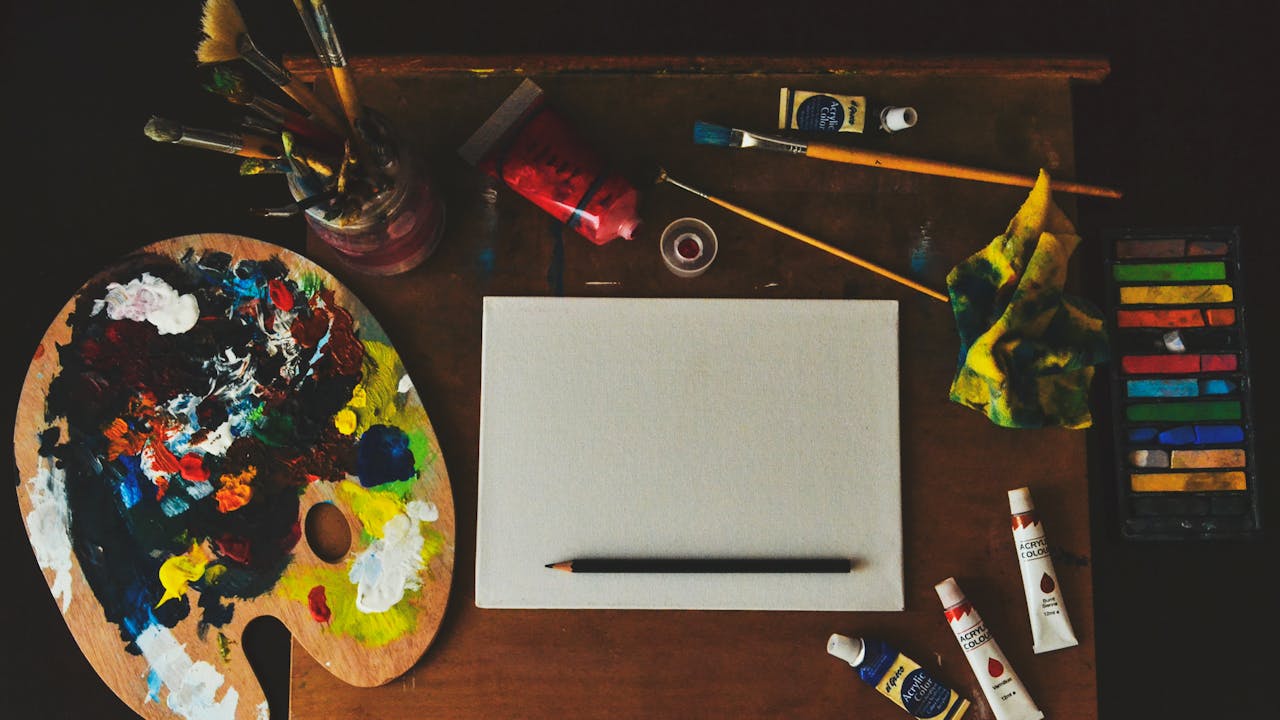
Your setup matters more than any single technique. Get it wrong and you'll fight your tools and your reference for the entire session.
Light source first. You want a single, strong light source coming from one side at roughly 45 degrees. This creates clear shadows that reveal the three-dimensional form of your face. Flat overhead lighting, which is what most rooms have by default, flattens everything. It removes the shadows that show where your cheekbones are, where your eye sockets are, where your nose casts a shadow across your upper lip. Flat lighting makes a face look like a map drawn from above rather than a landscape with hills and valleys.
Use a desk lamp placed to your left or right. The exact side doesn't matter much, but be consistent within a session. Moving the light between sessions will make your face look like a different person each time.
Mirror position is the other critical factor. The mirror should be at eye level and far enough away that you can see your full head and a few inches of neck and shoulder. If the mirror is too close, you'll see a distorted wide-angle version of your face. If it's too far away, you won't be able to read the details clearly. Roughly arm's length to two arm's lengths is the right range.
Mark your chair position with tape on the floor. This sounds fussy, but it matters. You'll need to stand up to look at your drawing, step back, assess, and then return to exactly the same position. If you don't mark it, you'll sit back down at slightly the wrong angle and your reference will shift.
Three-quarter view versus full frontal: start with three-quarter view. Full frontal is harder for beginners because it requires perfectly symmetrical placement of features and any deviation is immediately obvious. Three-quarter view, where you turn your head roughly 45 degrees, is more forgiving, more interesting compositionally, and what most of the great self portrait drawers chose most of the time.
The grid method step by step
Chuck Close's grid method isn't just for artists with prosopagnosia. It's the most reliable technique for accurately rendering what you actually see rather than what you think you see, and it works for photographs and for drawing from life equally well.
Here's how to do it.
Take a photograph of yourself or set up your mirror. If you're working from a photo, print it or display it on a screen. Use a ruler or tape to divide the photo into a grid of equal squares, roughly one inch by one inch. The more complex your photo, the smaller you might make the squares, but start with inch-by-inch and adjust from there.
Draw the same grid lightly on your paper. Match the proportions: if your photo is 4x5 inches and you're working on an 8x10 sheet, each cell in the photo corresponds to a 2x2 inch cell on your paper. The scale changes but the proportions stay identical.
Now look only at one cell at a time. In each cell, you're not drawing a nose or an eye or a cheek. You're drawing a collection of shapes, tones, and lines that happen to live inside that square. You're asking yourself: in this cell, what angles do the lines run at? Where is it dark? Where is it light? What shapes do the dark areas make?
This is the key insight of the grid method: it converts a face (which your brain has strong feelings about and will try to draw from symbol) into abstract visual information (which your brain will just copy). Most beginners don't draw what they see. They draw what they know. The grid breaks that habit.
Work across the grid systematically, or work from the most important features outward. Some artists do the eyes first because everything else anchors from them. Others work from the darkest area of shadow outward because establishing the darkest tone early helps calibrate everything else.
When you've filled every cell, erase the grid lines carefully. What remains should be a recognizable face.
The grid method also works for checking a drawing in progress. If something looks wrong and you can't identify what, lay a quick sketched grid over your drawing and compare it cell by cell to your reference. The error will become obvious almost immediately.
Pencil shading techniques
Shading is where most beginners abandon their portraits. They get a reasonable line drawing and then they start shading and it goes flat, muddy, or fake-looking in about four strokes. This happens because shading isn't a single skill. It's several specific skills used in sequence.
Start by identifying your three tonal zones before you make a mark: the lightest areas (highlights, often the forehead, the tip of the nose, the upper lip and chin when lit from above), the midtones (the broad planes of the face that receive indirect light), and the shadows (the eye sockets, the sides of the nose, the areas under the cheekbones and lips, the neck under the chin). Block these zones in your mind before picking up the pencil.
Hatching is the foundation technique. Draw parallel lines in one direction across a shadow area. The closer the lines, the darker the value. The angler you want the hatching to follow should roughly follow the form, meaning it should wrap around cylinders and spheres the way the surface wraps.
Cross-hatching adds density. Draw a second set of parallel lines crossing the first at roughly 45 to 90 degrees. Where two sets of lines cross, the tone darkens. Use this to build from midtone toward shadow.
Contour hatching, which Dürer and Rembrandt both used extensively, follows the three-dimensional form of the face. Lines curve around the eyeball following the sphere of the orbit. Lines run vertically down the side of the nose following its ridge. The marks don't just describe value, they describe form.
Blending with a tortillon or your fingertip softens transitions between values. Use it sparingly. Over-blending creates a smooth, slick look that removes the vitality from a drawing. Blend where transitions should be genuinely soft (the forehead plane fading into the hairline, the cheek plane softening into the neck) but leave your hatching marks visible where the form has more definition.
Build layers. Start light. Use a 2B or lighter for the initial mapping of values, then bring in a 4B or 6B to push the darks deeper. You can always darken, but lightening a pencil mark requires careful erasure and you'll disturb the paper texture.
The darkest darks in a face are usually the pupils and the nostril openings, followed closely by the deep shadows under the brow ridge and in the corners where planes turn away from the light. Getting those darks genuinely dark is what makes everything else look lighter.
Pencil grades explained
Pencil grades run from the hardest (9H) to the softest (9B), with HB at the center. The H grades have more clay in them, which makes them harder and lighter. The B grades have more graphite, which makes them softer, darker, and more prone to smearing.
For self portrait drawing, you need four pencils to start: HB, 2B, 4B, and either 6B or 8B.
HB handles your initial sketch lines, your proportional framework, and your lightest marking. It's forgiving, erases cleanly, and gives you control. Don't use anything harder than HB for initial lines, because H grade pencils leave grooves in the paper that graphite from softer pencils will fill even after you try to erase.
2B starts the first pass of shading, the light-to-midtone transitions, the areas that are softly lit rather than in full shadow.
4B handles midtone to shadow, the areas with more darkness, the planes that turn away from the light, the recesses of the eye sockets.
6B or 8B for your deepest darks only. Use these with restraint. Reserve them for the pupil, the deepest nostril shadow, the cast shadow under the chin if the light is positioned to create one, and the very back edge of the face where it turns completely away from the light.
Sharpen frequently. A blunt pencil can't describe fine detail and it tends to skate over paper texture rather than catching it. For the detail work around the eyes and lips, keep a sharp point.
Charcoal self portrait drawing
Charcoal is the oldest drawing medium in history. Artists used it to sketch compositions on walls before painting them in fresco. It remains the most forgiving and the most expressive tool you can use for a self portrait.
There are three forms of charcoal, and each has a different character.
Vine charcoal (also called willow charcoal) comes in sticks made from dried wood. It's soft, produces a cool gray rather than pure black, and erases almost completely. You can swipe vine charcoal off the paper with a soft cloth and barely a trace remains. This makes it ideal for your initial sketch and for establishing large tonal areas quickly. The downside is that it doesn't go very dark, so if you want deep shadows you'll need to work in layers or switch to something denser.
Compressed charcoal has binding agents added to the charcoal powder, which makes it denser, darker, and harder to erase. Where vine charcoal gives you soft, atmospheric marks, compressed charcoal gives you rich, dark, permanent-feeling ones. Use it for your deepest shadows and for areas where you want strong contrast.
Charcoal pencils give you the control of a pencil with the tonal quality of charcoal. They're sharpenable, which means you can get into fine detail work around the eyes. The trade-off is that they're harder to blend than stick charcoal.
The workflow for a charcoal self portrait is broader than for pencil. Where pencil work moves from precise lines into hatched shading, charcoal works best when you start with large tonal masses. Block in the shadow side of the face with a broad vine charcoal stroke. Establish the light and dark zones before committing to any feature detail. Then use your charcoal pencil to pull features out of those large shapes.
Paper texture matters enormously with charcoal. Smooth paper doesn't hold charcoal well and produces flat, shiny passages. Textured papers (newsprint, cartridge paper, toned drawing paper) grip the charcoal particles in their tooth and allow you to build layers.
Always use fixative when you're done. Unfixed charcoal smears onto anything it touches. A light spray of workable fixative lets you continue adding marks on top of fixed layers, which is how you build complex layered charcoal drawings without losing your earlier work.
Paper for self portraits
The paper you draw on affects the finished result as much as the medium you use. Cheap paper produces cheap results, not always because it looks worse, but because it limits what you can do.
Bristol Vellum (also called Bristol with a slight tooth) is the standard choice for graphite pencil work. It has enough texture to hold multiple layers of pencil without the tooth becoming overworked and shiny, but it's smooth enough to allow fine detail. It erases cleanly and holds line quality well.
Bristol Smooth is better for very detailed work where you want maximum sharpness in your lines. It's too smooth for heavy charcoal use, but for pencil portraits with fine detail around the eyes and lips, it gives you precise control.
Newsprint is the practice paper of art schools. It's cheap, comes in large pads, and has enough tooth for charcoal. The downside is that it's acidic and yellows quickly, so any drawings you want to keep long-term need to be photographed before the paper degrades. For practice sessions and rough studies, it's perfect.
Toned paper (gray, tan, or black) changes your approach entirely. Instead of working from white up into grays and blacks, you work both up toward highlights and down into shadows. You need a white pastel or white charcoal pencil to add highlights, and you use the tone of the paper as your midtone. Many of Kollwitz's most powerful charcoal self portraits were made on toned paper, where the warm gray ground contributes to the atmospheric weight of the image.
Whatever paper you choose, tape it securely to your drawing board. Paper that moves while you're working destroys the precision of your marks.
Digital self portrait drawing
Drawing on a screen removes several of the traditional challenges (you can always undo, you can adjust opacity without pressure sensitivity, you can zoom in to extraordinary detail) but it introduces new ones, mostly related to the feel of the tool.
Procreate is the dominant app for iPad drawing. It costs $12.99 as a one-time purchase, runs only on iPad, and has a brush library that replicates most traditional media convincingly. The Apple Pencil integration gives you genuine pressure sensitivity, so you can work lightly for initial marks and lean in for darker strokes. The layer system lets you work on your sketch, shading, and detail on separate layers and merge them when you're satisfied.
Adobe Fresco offers a free tier with enough tools for serious portrait work, runs on both iPad and Windows, and has a unique feature: live brushes that simulate the wet interaction of paint on paper, including charcoal and pastel. For artists transitioning from traditional media, it often feels more natural than Procreate.
SketchBook by Autodesk is free across all platforms, including Android and desktop, and is the most accessible option if you don't have an iPad. The brush engine is simpler than Procreate's, but it's more than adequate for self portrait drawing, and the interface is clean and uncluttered.
For those who want to experience a painted self portrait without drawing it, AI portrait generators have improved dramatically. None of them yet match the quality of a hand-rendered commission, but they can produce interesting stylized interpretations. If you want something closer to a genuine classical painting rather than an AI-generated image, Fable's portrait service uses human artistry to transform your photo into something that actually belongs on a wall.
Common mistakes beginners make
| Mistake | What causes it | How to fix it |
|---|---|---|
| Eyes placed too high | Visual memory of faces emphasizes the lower half | Measure: eyes sit at the exact vertical midpoint of the skull, not the forehead |
| Eyes placed too close together | Underestimating the intercanthal distance | Use the rule of five: one full eye-width between the eyes |
| Starting too dark too fast | Impatience to see results | Start with HB and establish all values lightly before committing |
| Symbol drawing | Drawing what you know instead of what you see | Use the grid method to convert the face into abstract shapes |
| Hairline as solid shape | Hair drawn as a decorative element rather than a three-dimensional mass | Observe the hairline carefully, it has shadow and light like everything else |
| Ignoring the skull | Drawing a mask-like face without depth | The face wraps around a skull. Every feature sits on a three-dimensional form, not a flat surface |
| Not using the mirror check | Getting too close to the work to see errors | Step back regularly and view the drawing in a mirror (errors reverse and become visible) |
The symbol drawing problem deserves more attention because it's the hardest to break. From early childhood, humans learn to recognize faces by their defining features, and we store shorthand symbols for those features: an oval for the eye, a triangle for the nose, a curved line for the mouth. When we draw from memory, we deploy those symbols. The result looks like a cartoon, not a face.
The grid method is the most reliable cure, but you can also practice by drawing upside down. Turn your reference photo upside down and draw what you see. Your brain doesn't have a symbol for an upside-down face, so it's forced to just copy the shapes. When you flip the drawing right-side up, you'll often find it's more accurate than anything you drew the conventional way.
Your first self portrait session: a practical walkthrough
You've read the theory. Now here's exactly what to do when you sit down.
Set up your light source 45 degrees to your left, at roughly the height of your face. Position your mirror at eye level, about an arm's length away. Turn your head roughly 45 degrees to the right (so the light hits the left side of your face). Mark your chair position with tape. Put on something you'd be comfortable sitting in for an hour.
Get your paper, your HB and 2B pencils, and an eraser.
Step one: block the head shape. With your HB pencil, draw the overall egg-shape of your head very lightly. Don't press hard. This is scaffolding. Get the proportions roughly right: the head is taller than it is wide, and the narrower end is at the chin.
Step two: mark the eye line. Find the vertical midpoint of your egg shape and draw a very light horizontal line across it. This is where your eyes will sit.
Step three: mark the thirds. Divide the face vertically into thirds: hairline to eyebrows, eyebrows to nose base, nose base to chin. These three zones are roughly equal.
Step four: place the features using your proportion rules. Mark the five eye-widths across the face. Mark where the ears will sit (top of ear at eyebrow height, bottom at nose height). Mark the nose width (aligned with the inner eye corners) and the mouth width (aligned with the inner pupil edges).
Step five: observe before you draw. Look at your face in the mirror for a full two minutes before making any more marks. Notice the specific curves, the shadow zones, the color differences in tone. Let your eye travel over the surface. This preparation time pays off enormously.
Step six: develop the features lightly. Work from the eyes outward. Draw the eyes as shapes, not symbols. Observe the actual shape of each eyelid, the thickness of the lid edge, the way the upper lid casts a shadow on the eyeball. Draw what you see, not what you know.
Step seven: establish tonal zones with your 2B. Using light, broad hatching strokes, block in the shadow side of the face and the deep shadow areas (eye sockets, beneath the nose, under the lower lip). Don't blend yet. Just establish the darks.
Step eight: step back and look. Stand up, step back three feet, and look at your drawing as a whole. Does the overall shape feel right? Are the eyes at the midpoint? Is one side too wide? This is the most important step in the entire process, and most beginners skip it because they're afraid of what they'll see. Look anyway.
Step nine: refine and darken. Using your 4B pencil, push the darkest shadows deeper. Refine the features. Work on the specific shapes that don't yet look like what you see.
Step ten: finish lightly. The first session doesn't need to be a finished portrait. Stop when you've learned something, even if the drawing is rough. Each session builds on the last.
The therapeutic side of self portrait drawing
Art therapy researchers have documented something that practising artists have known for much longer: the act of sustained visual attention to your own face changes the way you relate to it.
Studies published in Arts in Psychotherapy have shown that self portrait exercises are effective in treating depression and processing PTSD. The mechanism isn't mysterious. Spending an hour looking carefully at your own face, not evaluating it against some ideal, but simply observing it as an object with specific shapes and tones and shadows, dismantles the reflexive self-criticism that most people bring to their own reflection.
When you draw, you're not wondering if you look good. You're wondering if the shadow under your lower lip is darker or lighter than the shadow under your nose. You're asking whether the left eye is slightly lower than the right (it usually is) and how to represent that accurately. You're thinking about light and form, not about whether you measure up to some standard.
This shift in attention is the therapeutic core. Sustained observation, freed from judgment, creates a different relationship with the thing being observed. Artists who practice self portraiture for years often report that they become more comfortable with their own face, not because they've idealized it or learned to ignore its imperfections, but because they've truly seen it. And seen it as something more than a social presentation, as a three-dimensional object with its own structure and character.
The sustained attention required for self portrait drawing also has well-documented benefits for concentration and stress reduction. It's an absorbing practice that crowds out rumination. An hour of serious drawing rarely leaves room for anxious thought loops, simply because the technical demands are too specific and immediate.
If you're interested in art and its connection to mental wellbeing, the blog has explored related themes in various places, from the meditative qualities of animal portraiture to the emotional weight of memorial art.
Portrait art as a gift
A hand-drawn self portrait is one of the most personal gifts you can give. It says something about both the giver and the subject: here is how I see you, and I spent hours looking carefully enough to put it down on paper. There's no way to fake that. It can't be bought off a shelf. It's a record of attention.
If you've developed your self portrait drawing practice to the point where you're producing work you're proud of, consider giving a portrait as a gift for a significant occasion. A drawn portrait for a birthday, an anniversary, or a wedding carries a weight that almost nothing purchased can match.
For those who want to give portrait art without drawing it themselves, the options extend well beyond generic prints. Fable's custom portrait service is designed exactly for these situations. Upload a photo, choose a style ranging from renaissance classical to modern interpretations, and receive a print-quality portrait painting that works as a graduation gift, a Mother's Day gift, or a memorable Christmas present.
The family portrait options are particularly popular for occasions where you want to include multiple people in a single composition. Fable also offers couple portraits and kids' portraits for those moments that deserve to be preserved in something more lasting than a digital photograph.
Portrait art as a gift works across virtually every context. It works for people who love art, for art students, for photographers, and for people who've never set foot in a gallery but who would nonetheless be moved to see themselves or someone they love rendered in a classical portrait style.
Portrait styles beyond realistic
Realistic rendering is the most technically demanding form of self portrait drawing, but it isn't the only one, and it isn't always the most interesting one.
Abstract self portraiture treats the face as a compositional problem rather than a representational one. Artists like Picasso and Francis Bacon fragmented and distorted their faces in service of psychological truth rather than visual accuracy. An abstract portrait can be more emotionally expressive than a photographically precise one, precisely because it doesn't require you to be bound by what the face actually looks like. If you're interested in this approach, Picasso's cubist self portraits are worth studying closely, and the approaches he used (multiple viewpoints collapsed into a single image, planes of the face flattened into geometric shapes) are more accessible to beginners than you might expect.
Surrealist self portraiture, in the tradition of Dalí and Magritte, treats the face as a site for psychological imagery rather than just a physical description. Surrealist art prints often place recognizable faces in impossible contexts or merge them with landscape elements, dream imagery, or symbolic objects. This approach requires less technical accuracy and more imaginative invention, which makes it accessible to artists who haven't yet mastered proportion.
Classical self portraiture in the tradition of the Dutch Golden Age or the Italian Renaissance is the most formal approach, focused on capturing likeness, lighting, and the specific character of a face with maximum fidelity. This is the tradition Fable works in when transforming photographs into portrait paintings, and it's worth studying even if your own work heads in a different direction.
Charcoal sketch style, a loose and expressive approach that captures the spirit of a face without aiming for photographic accuracy, is often the most satisfying starting point for beginners. The marks are forgiving, the scale is flexible, and the results can be genuinely beautiful even before you've mastered proportion.
For more on how portrait orientation and framing affect the reading of a portrait, portrait vs. landscape is worth reading, as are the explorations of senior portrait poses and senior portrait outfits for thinking about how presentation and context shape the way a portrait reads.
The marriage portrait tradition is one of the oldest in Western art, and understanding it gives you insight into how portrait convention evolved. The maternity portrait is another context where portrait tradition intersects with powerful personal meaning. For seasonal portrait inspiration, fall family portrait ideas and Christmas portrait ideas are useful starting points.
FAQ
How long does it take to learn to draw a recognizable self portrait?
Most beginners can produce a recognizable face within their first few sessions if they follow the proportion rules carefully and use the grid method. A portrait you'd be genuinely proud of takes longer, usually several months of regular practice. The key variable isn't raw talent, it's observation. Artists who learn to really look at what's in front of them progress faster than those who draw from habit or symbol. Consistent short sessions (45 minutes to an hour) two or three times a week will show measurable improvement within four to six weeks.
Do I need expensive supplies to start?
No. A set of pencils (HB, 2B, 4B, 6B), a pad of Bristol Vellum or even good-quality cartridge paper, and a kneaded eraser are enough to produce serious work. Total cost is under $30. The expensive supplies, better charcoal, toned paper, high-quality brushes for mixed media work, matter at more advanced stages. Beginning with simple tools forces you to develop skill rather than relying on equipment.
Is it better to draw from a mirror or from a photo?
Both have value. Drawing from a mirror trains real-time observation and forces you to work quickly enough that you can't over-render. Drawing from a photograph allows longer, more deliberate sessions and gives you a fixed reference that doesn't shift. Many artists do preliminary sketches from mirror reference and then work up a finished piece from a photograph taken in the same pose. If you're using a photo, make sure it's taken with the same lighting setup you'd use for a mirror session, single directional light rather than flat ambient light.
What's the most common reason beginners give up?
The gap between what they expected and what they produced in the first session. Most people expect that with enough effort, the first drawing will look roughly like them. Often it doesn't, and that gap feels like evidence of permanent incapacity rather than just being at the beginning of a learning curve. The fix is to manage expectations and to keep early drawings rather than throwing them away. Looking back at session three from session twenty is one of the most motivating experiences a developing artist can have.
How do I draw curly or textured hair?
Don't draw individual hairs. Draw the light and shadow shapes within the hair mass. Identify where the light hits the hair and leave that area light. Build shadow using broader strokes that follow the general direction of the hair's movement. The texture of curly hair comes from small, varied dark marks within the shadow areas, not from trying to trace individual curls. Step back and squint at your reference. The hair simplifies into large light and dark shapes. Draw those shapes.
Should I draw what I look like or what I want to look like?
Draw what you look like. The greatest self portrait drawers, from Rembrandt to Kollwitz, derived their power from honest observation rather than idealization. That doesn't mean you have to emphasize every flaw or work in a harsh style. It means you represent what's actually there. You'll find that accurate observation, done with real attention, produces portraits that are more interesting and more alive than anything idealized. The asymmetries and specifics of a real face are what make it recognizable as a specific person.
What if I don't have a mirror?
You can work from photographs, and many serious portrait artists prefer it. Take your own photograph in strong directional light from the angle you want to draw. A 3/4 view with a single lamp from the left or right works well. Print it if possible (a printed reference is easier to work from than a phone screen, which dims and activates constantly) or prop a tablet or laptop at the same height as your drawing board. Working from a photograph rather than a mirror removes the challenge of your subject moving but introduces a new challenge: a photograph flattens the three-dimensional information that a mirror preserves.
Can self portrait drawing help with face recognition or memory?
There's some evidence that sustained observational practice improves visual memory for faces in general. The cognitive work involved in careful observation, tracking subtle differences in proportion, noting specific shapes rather than applying general categories, engages facial processing systems in ways that casual observation doesn't. Artists who draw portraits regularly often report becoming better at recognizing and remembering faces. Whether this extends to clinical prosopagnosia (the condition Chuck Close has) is a different question, but for normal face memory, drawing practice seems to sharpen the skill.
Related guides
- Abstract portraits: styles, history, and how to commission one
- Birthday portrait gifts: what to order and why portraits outlast everything else
- Anniversary gift portrait: a guide to giving the most personal present possible
- Art gifts for mom: 25 ideas that will actually mean something
- Gift ideas for artists: what to buy the person who already has everything
Sources
- Rembrandthuis Museum, Amsterdam: Rembrandt Self-Portraits research archive
- The Metropolitan Museum of Art: Dürer and the Northern Renaissance drawing tradition
- Arts in Psychotherapy journal: Self-portrait interventions in clinical art therapy research
You started this guide wanting to know how to draw yourself. What you've found, if you've read this far, is that the self portrait is never just a technical exercise. It's a practice that the greatest artists in history returned to again and again, not because it was easy or comfortable, but because looking honestly at your own face and putting it down accurately on paper is one of the most demanding and most honest things you can do.
Rembrandt did it 100 times and found something new each time. Frida Kahlo did it from a hospital bed and turned it into one of the most important bodies of work in twentieth-century art. Chuck Close did it despite not being able to recognize his own face, cell by grid cell, and produced images nine feet tall that stop you in your tracks.
You don't need to match any of them. You just need to sit down, mark your chair position, get your light right, and start looking.
And if you want to see what a self portrait looks like when it's rendered in the full tradition of classical painting, rendered from your own photograph by artists who understand exactly what the great masters were doing, Fable's self portrait service is the place to go. The result is something worth hanging. Something worth keeping.
Start drawing. Or start with Fable. Either way, you end up with a portrait that matters.