Family Portrait Outfits: What to Wear Guide
You've been planning this portrait session for weeks. Location: booked. Photographer: hired. Kids: reluctantly on board. And now, three days before the shoot, everyone is standing in the bedroom staring at a pile of mismatched clothes with absolutely no idea what goes together.
Family portrait outfits are where so many sessions quietly fall apart. Not on the day itself. Not when the photographer presses the shutter. But right here, in this moment of decision, when nobody can agree and the clock is ticking.
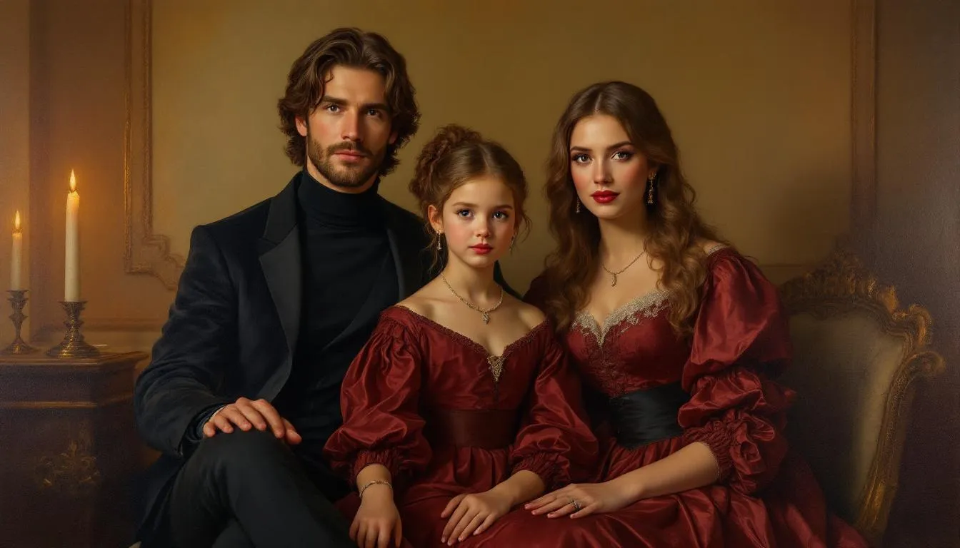
Before we get into color palettes and what to avoid: the most timeless family portraits in the world aren't photographs. They're paintings. Fable creates custom painted portraits from your family photo, transforming your image into classical fine art that looks like it belongs in a museum gallery. No wrinkled shirts. No colors clashing. No worrying about whether the kids held their smiles long enough. Just your family, painted with warmth and depth, looking exactly the way you want to be remembered for generations. It's the kind of portrait that hangs on your wall for decades and becomes the piece everyone in the family fights over when it's time to inherit it.
But if you're planning a photo session, getting the outfits right makes a real difference to how the final images look. This guide covers everything: color theory, what to avoid, seasonal palettes, how to coordinate without looking like a matching set, and how to make a family of five look like they all belong in the same frame.
The most important rule: don't match, coordinate
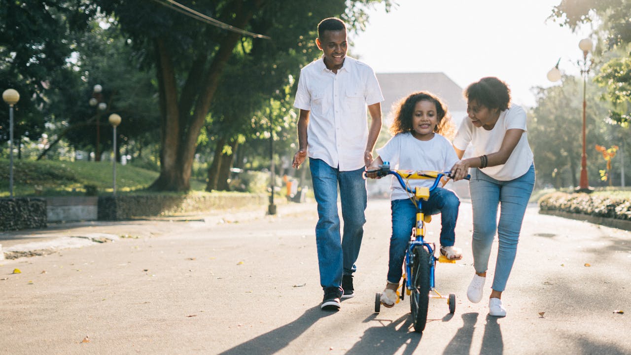
Most families hear "family portraits" and immediately think: same color shirts. Everyone in white. Or all in navy. Or denim on denim. And while there's nothing technically wrong with it, matching outfits can make a portrait look stiff and forced.
The human brain is wired to spot patterns. When every family member wears identical colors, that pattern becomes the first thing viewers see. Before they notice the genuine smiles, the tender way a parent holds a child, or the warm light catching the moment, they see: matching shirts. And then the photo feels like a catalog shoot rather than a portrait of real people who love each other.
Coordination is different. It's about choosing colors that belong in the same palette without being identical. Think of it like decorating a room: you don't want every cushion the same color, but you want everything to feel like it came from the same world.
A good coordinated look might have mom in a dusty sage dress, dad in navy chinos and a cream shirt, and the kids in soft blue and ivory. No one is matching. But everything works together. The viewer's eye moves naturally across all the faces without any one outfit screaming for attention.
This is the foundation of every great family portrait outfit decision. Start here, and everything else gets easier. If you're planning for a specific season, our guide on fall family portrait ideas has more on how to approach seasonal coordination in particular.
Color theory for family photos
You don't need to be a graphic designer to understand which colors work together. There are a few reliable principles that professional photographers and stylists use on every shoot.
The 60-30-10 rule. Pick one dominant neutral (cream, navy, khaki, soft grey) that covers about 60% of the visual palette. Then pick a secondary color for about 30% of the look. And use one accent color for the remaining 10%. This ratio feels balanced and intentional without being rigid. A family of four might have two people in navy (60%), one in cream (30%), and one in a soft dusty rose (10%).
Analogous palettes. These are colors that sit next to each other on the color wheel: blues and greens, greens and yellows, pinks and corals. They're easy on the eye and look naturally harmonious in photos. Think sage green, muted olive, and warm cream, or dusty blue, soft teal, and ivory.
Tone and saturation matter more than hue. Colors that are similar in brightness photograph better together than colors at wildly different saturation levels. A muted rose and a muted blue work well together. A neon orange and a muted grey do not. Keeping all your colors at a similar level of softness creates cohesion even when the actual colors are different.
Warm versus cool palettes. Warm palettes (cream, rust, terracotta, burnt orange, gold) feel rich and cozy. They work especially well for outdoor autumn sessions or indoor warm-lit studios. Cool palettes (dusty blue, sage, muted lavender, slate grey) feel calm and airy. They work well for beach sessions, spring outdoor shoots, or minimalist studio setups.
Choose a palette direction first, then find individual colors within it for each family member. That single decision prevents 80% of the outfit conflicts families face. You can also browse our collection of family portraits to see how different palettes translate into finished portrait art.
The best color palettes for family portraits
Certain combinations consistently look beautiful in portraits. Here are the ones professional photographers recommend most often.
Navy, cream, and soft blush
This is arguably the most versatile palette in family portrait photography. Navy is strong and grounding. Cream adds lightness and warmth. Soft blush brings a gentle feminine touch without being overpowering. It works across seasons, locations, and family sizes. It photographs well on almost every skin tone.
Sage green, ivory, and warm brown
Earthy and organic, this palette is ideal for outdoor sessions in natural settings. Sage reads as soft but still distinct. Ivory prevents the look from going too dark. Brown adds depth and warmth. Together, they feel connected to nature without looking like everyone raided the camping store.
Dusty blue, warm grey, and white
A cooler palette that reads as calm and refined. Excellent for beach settings, minimalist studios, or winter sessions with soft natural light. White is allowed here in small doses because it's balanced by the grey. The key is keeping the white off the dominant color spot so it doesn't wash anyone out.
Burgundy, mustard, and olive
For autumn specifically, this jewel-toned palette is rich and vibrant without being overwhelming. Burgundy and mustard together feel warm and festive. Olive brings in a natural, grounded note. This combination photographs beautifully against fall foliage and golden afternoon light. See more ideas in our fall family portrait ideas guide.
Rust, cream, and forest green
An earthy but slightly bold combination that works year-round but especially shines outdoors. Rust adds warmth and richness. Forest green is deep and natural. Cream keeps the palette breathable. This is a palette that photographs beautifully in late afternoon light and looks distinctive without being difficult to coordinate.
For Christmas and holiday portraits, check out our xmas portrait ideas guide, which covers palettes specific to festive sessions.
What not to wear for family portraits
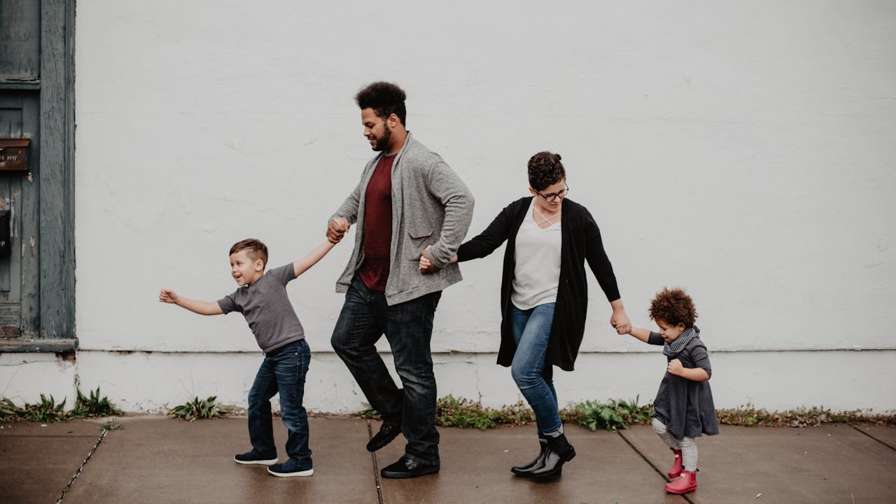
Knowing what to avoid saves you from the most common mistakes. These are the things that reliably cause problems in finished portrait images.
Bright neon colors. Neon shades are too intense for most portrait lighting. They draw the eye away from faces, can create color cast on skin in close-up shots, and look jarring against most backgrounds. If you love color, choose a muted or dusty version of the same hue instead.
Solid bright white. This surprises people. But bright white is genuinely difficult in portrait photography. In overexposed areas, it goes blown-out and loses all detail. In natural lighting, it can pick up color casts from the sky or foliage. Soft ivory, off-white, or cream all photograph better and still read as light and bright in the final image.
Busy patterns and logos. Small busy patterns like thin stripes, fine plaid, or intricate prints can create a moiré effect in digital images. They also draw attention away from faces. One person in a subtle pattern against others in solids can work beautifully. But when multiple family members wear busy patterns, the portrait feels visually chaotic.
Head-to-toe black. Black isn't a problem in small doses. But when everyone wears black, the portrait loses depth and warmth. It also tends to flatten the group into a dark mass. If someone loves black, use it as one accent piece against a range of other colors in the group.
Clothes that don't fit. This one sounds obvious, but it's overlooked constantly. Clothes that are too tight, too loose, or visibly ill-fitting are noticed in portraits. Check fits in natural light and in movement, not just standing still.
Different formality levels. One family member in a formal suit and another in jeans creates visual imbalance. Everyone doesn't need to dress at the same level, but the gap should be narrow. Casual-smart works. Formal-plus-beach casual does not.
Seasonal family portrait outfits
Seasons change the palette, the fabric, the light, and the overall feel of a portrait session. Dressing for the season isn't just about warmth. It's about visual harmony between your outfits and the world around you.
Spring family portrait outfits
Spring is the season of light and freshness. The natural backdrop is coming alive with soft greens, pale pinks, and whites. Your outfits should feel at home in that environment.
For spring, reach for pastels and soft neutrals. Blush pink, lavender, pale yellow, mint green, and soft white all photograph beautifully in this season. Light fabrics like cotton and linen read as fresh and relaxed. Avoid heavy knits or dark earth tones, which can look out of place against blooming spring backgrounds.
For little ones, a soft floral print on a dress paired with solid neutrals on the rest of the family brings in a seasonal element without overwhelming the palette. Moms often lead the look in spring sessions, with a soft floral or linen midi dress setting the tone, and everyone else's outfits building from there.
Summer family portrait outfits
Summer brings bright, strong light that can be harsh at midday. Most photographers prefer golden hour sessions in the early morning or late afternoon, when the light is warm and soft. Your outfits should suit that warm, relaxed atmosphere.
Linen is your friend in summer. It breathes, it photographs beautifully, and it moves naturally in outdoor settings. Blues, greens, and neutrals are classic summer choices. Think navy linen shirts, white or cream sundresses, soft chambray, and earth tones that warm in golden light.
The color palette leans a little cooler in summer to balance the warm light. Dusty blue against cream in late afternoon light creates gorgeous results. Avoid synthetic fabrics that can look shiny in bright light and add texture variety wherever you can.
Fall family portrait outfits
Autumn is the most popular portrait season for a reason. The light is warm and golden, the backgrounds are rich with color, and there's an emotional warmth to the season that photographs beautifully.
Lean into the season's palette here. Burgundy, rust, burnt orange, forest green, mustard, and deep teal all belong in the autumn portrait color wheel. Warm browns and chestnut tones anchor the palette. Layer up with knits, flannels, and warm textures that look right in the setting.
For a practical guide to full fall session planning, our fall family portrait ideas post goes deep into locations, timing, and how to dress for the light. Fall outfits are where you have the most freedom to use rich, bold colors, and the season rewards that boldness.
Winter and holiday family portrait outfits
Winter portraits have a different character. The natural environment is often stripped back, which means the portraits rely more heavily on the clothing itself to create visual interest and warmth.
In winter, one bold color choice anchors the whole palette. Deep red, rich plum, forest green, and midnight navy all work well as the dominant color. Build the rest of the outfits around that anchor. Texture becomes more important in winter, so use chunky knits, velvet, and layered fabrics to add visual depth.
For Christmas and holiday sessions specifically, our xmas portrait ideas guide has full palette breakdowns for festive portrait sessions.
How to build the look: start with one outfit
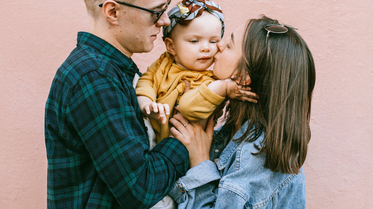
The single most effective technique for coordinating family portrait outfits is to start with one person's outfit and build everything else from there.
This is the technique professional stylists use on every family shoot. Choose the outfit that's either the most difficult to find or the most important to get right. Usually that's mom's dress, because it tends to have the most visual weight in a family portrait and sets the tone for the rest of the group.
Find a dress or outfit with two or three colors in it. Now you have a ready-made palette. Everyone else's outfits just need to pull from those colors. If mom is wearing a dress with dusty blue, ivory, and a hint of terracotta, dad gets dusty blue or ivory. The children can wear pieces in any combination of those three colors. The palette already exists in that one outfit, and you're just echoing it through the group.
This approach works especially well for large family portraits where you have many people to coordinate. The more people you have, the more important it is to anchor the palette in one confident choice and build outward from there. For couple portraits, the same principle applies. Start with the outfit that has more color detail and simplify the partner's look to complement it. Our couple portraits gallery shows how effective this approach is in practice.
Tips for large and extended families
Coordinating outfits for a nuclear family of four is manageable. Coordinating a group of fifteen for an extended family reunion portrait is a different kind of challenge entirely.
For large groups, establish the palette broadly and give people flexibility within it. A three-color system works well here. Pick one anchor color (navy, forest green, burgundy) and let each family unit use it in different amounts. One branch of the family might wear mostly navy with cream accents. Another might wear cream with navy accents. The whole group reads as coordinated, but there's natural variation that makes the portrait look like real people rather than a uniform.
Avoid requiring everyone to wear exactly the same thing. At scale, this creates a rigid, corporate feel. The goal is family harmony in the portrait, not military uniformity.
Communicate the palette well in advance. Send everyone a color swatch image so there's a shared reference point. Specify what to avoid (neon, busy patterns, solid white). Within those guidelines, let people choose what makes them feel good. Confidence and comfort show up in portraits. Someone wearing an outfit they hate, however well-coordinated, will show it.
For extended family sessions that include kids from multiple branches, our kids portraits page has examples of how children's outfits integrate into the broader family look.
Location and your outfits
Where you're shooting affects what you should wear. The environment is part of the portrait, and your clothing should feel at home in it.
Outdoor natural settings
Woods, fields, and parks have organic, earthy backdrops. Palettes that contain some of the environment's natural tones, greens, creams, browns, and warm rusts, will feel harmonious. Bright, saturated colors can work as accents but shouldn't dominate. The goal is to belong in the landscape, not fight it.
Avoid white against snowy or very pale backgrounds where the clothing can disappear into the scenery. Avoid dark neutrals against dark forest backgrounds for the same reason. Contrast between your clothing and the background helps the family stand out clearly.
Beach sessions
Beach portraits have a specific visual language. The combination of sand, sky, water, and natural light creates a palette that leans toward relaxed and natural. White, ivory, and cream work beautifully here, especially when paired with dusty blue, soft teal, or warm tan. Linen, cotton, and flowing fabrics move well in the beach breeze and look natural against a coastal backdrop.
Avoid heavily layered or structured clothing that looks out of place in a relaxed seaside environment. And avoid very dark colors that absorb heat uncomfortably during a beach session.
Studio portraits
Studio sessions have a controlled environment, which gives you more freedom with the palette. Without a natural backdrop to harmonize with, you can use bolder colors or more formal styling.
Studio backgrounds tend to be neutral (white, grey, black, or textured neutrals), which means your clothing palette becomes the dominant color story. Jewel tones like deep teal, rich burgundy, and forest green photograph beautifully against studio neutrals. This is where a more formal, polished look can work well without feeling out of place.
If you're planning a studio session specifically for creating a lasting keepsake, it's worth knowing that many families choose to use their studio portrait photo as the reference image for a Fable custom painting. The controlled lighting and clean composition of a studio portrait tends to translate especially well into painted fine art.
Accessories and shoes: the finishing details
Accessories and footwear are often an afterthought in family portrait planning. They shouldn't be. They're visible in nearly every shot and can either complete a look or quietly undermine it.
Shoes matter more than you think. In full-length portraits, shoes are prominently visible. And there's nothing that disrupts an otherwise well-coordinated portrait like one family member in trainers and everyone else in leather shoes, or mismatched flip-flops in a polished studio session. Decide on footwear as part of the outfit planning, not as an afterthought. Bare feet work beautifully in beach sessions and are increasingly used for informal outdoor shoots too.
Keep jewelry subtle. Large, statement jewelry can distract from faces in close-up shots. Simple, clean pieces let the portrait's emotional content stay front and center. If you love jewelry, choose one or two pieces rather than layering heavily.
Hats and accessories can add personality. For more relaxed, casual sessions, a single hat or a scarf can add visual interest and personality to the portrait. The key is keeping it to one or two accents in the whole group, not everyone wearing a statement accessory at the same time.
Children's accessories deserve attention. Children's hair accessories, in particular, should be coordinated with the palette. A bright neon hair tie in an otherwise muted-palette portrait will be visible in every shot. Small details matter.
After the session: making it permanent
The session is over. You've got the photos. And now you face the classic problem: what do you actually do with them?
Most family portrait photos end up in one of two places. They get posted on social media for a week and then scroll away into the archive. Or they get printed in a 4x6 and go into a drawer. Neither is the fate a beautiful portrait session deserves.
The families who do this best turn their portrait into something permanent. A canvas print. A framed gallery display. Or something even more lasting: a custom painted portrait.
Fable takes the best image from your portrait session and transforms it into a hand-styled, museum-quality painted portrait. It's the kind of artwork that goes above the fireplace, not into a drawer. See our family portraits gallery to understand what that transformation actually looks like. It's also one of the most meaningful gift ideas in our family gift ideas guide.
For milestone occasions, a custom portrait from your family photo session makes an extraordinary gift. Our anniversary gift portrait guide covers this in detail for couples. And our birthday portrait gifts post explores how to give a portrait as a gift for someone you love.
Common outfit mistakes and how to fix them
Even well-intentioned families make the same mistakes. Knowing them in advance saves a lot of stress on the day.
Starting too late. Outfit coordination takes time. Starting the day before the shoot means you won't have options if something doesn't work. Start planning at least a week out. That gives you time to shop, try combinations, and make adjustments without panic.
Forgetting to check the background. The location backdrop affects how every color in your outfit reads. What looks great in your living room mirror might disappear into a forest background or clash with a brick wall. If you know the location in advance, look at reference images from that setting and check your palette against it.
Letting kids dress themselves without oversight. Children, especially older kids with strong opinions, will push back against outfit decisions. That's fair. But left entirely to their own devices, the result is often a mismatched surprise on shoot day. Involve them in the decision, give them choices within the agreed palette, and get buy-in early.
Not wearing comfortable clothes. Portrait sessions involve sitting, standing, crouching, walking, and sometimes running after children. If someone's outfit is uncomfortable, it shows in their body language and on their face. Comfort is a legitimate factor in outfit selection, not a secondary one.
Ignoring the season. Wearing heavy knits in August or thin linen in December creates practical discomfort and visual incongruity. Dress for the actual conditions of the shoot, not just for how you want the final image to look.
Over-coordinating. Some families get so focused on making everything match perfectly that the outfits start to feel rigid and corporate. The best coordinated looks have some variety and individuality within the overall palette. That's what makes a family portrait look like a family and not a brand campaign.
Building your Fable portrait from the photo
Many families find that the right outfit for a portrait session isn't really about the day of the shoot at all. It's about what that portrait becomes.
A beautifully coordinated family photo becomes the raw material for something far more permanent when you work with Fable. You choose the image that captures your family at their best. Fable's artists do the rest, transforming it into classical painted fine art with the kind of depth and warmth that photography simply can't replicate. Check out how it works to see the process. And browse pricing to understand your options.
For ideas beyond family portraits, explore our full blog where you'll find guides on senior portrait outfits, senior portrait poses, pet family portraits, and anniversary gift portrait ideas.
Frequently asked questions
What colors should I avoid for family portrait outfits?
Avoid solid bright white (which can blow out in photos and pick up color cast), neon colors (which overpower skin tones), and head-to-toe black for the whole family (which creates a flat, heavy look). Also avoid very busy small patterns and prominent logos, which can create visual noise and distract from faces.
Should everyone wear the same color for family portraits?
Matching exact colors is not recommended. It can make the portrait look stiff and forced. Coordination is the goal: choose 3 to 4 colors in the same palette and have each family member wear combinations of those colors. This creates visual cohesion without making everyone look like a uniform.
How do I coordinate outfits for a large extended family?
Establish a broad palette of 3 colors and communicate it clearly to each family unit. Give flexibility within that palette rather than requiring identical outfits. One family unit might lean more on the navy, another more on the cream. The shared palette creates unity while allowing natural variation that reflects the diversity within the family.
What should I wear to a beach family portrait session?
Light, natural fabrics like linen and cotton work best at the beach. Choose a palette of neutrals with one or two accent colors: white or ivory with dusty blue, or cream with soft teal are classic choices. Avoid heavy structured clothing that looks out of place in a relaxed coastal setting. Bare feet or simple sandals work well for beach sessions.
How far in advance should I plan family portrait outfits?
Start planning at least one to two weeks before the session. This gives you time to try different combinations, check how they look together in the actual light of your shoot location, shop for any missing pieces, and involve the kids in the decision process early enough to avoid last-minute resistance.
What's the single best tip for coordinating family portrait outfits?
Start with one person's outfit that already contains two or three colors you love together. Use that outfit as your palette guide and dress everyone else to echo those same colors in different combinations. This approach ensures the whole group looks cohesive because every outfit traces back to the same color story.
Related guides
- Fall family portrait ideas
- Xmas portrait ideas
- Senior portrait outfits
- Pet family portraits
- Family portraits
Sources
- Christopher Todd Studios: What Colors to Wear for Family Photos
- Kellie Photo: The Impact of Colors in Family Portraits
Outfits matter. But they're not the memory. The people in the portrait are the memory. The way a dad's hand rests on his daughter's shoulder. The way siblings lean into each other even when they're supposed to be standing up straight. The way a family looks when they're all together in one place, trying to hold still, and somehow holding onto something.
Get the outfits right and the photographer has the best possible materials to work with. Then give that image a life beyond the phone gallery. Turn it into something that lasts. Start here and create the portrait your family deserves to have on the wall forever.